So, Jesse has been hounding me to write a bit about User Experience (UX to some) for quite a while and I was struggling with where to begin with it. It’s a huge, vast, (and quite honestly at this point) subjective concept and for the longest time I just didn’t know where to begin. I know that once I get going on something that there’s no stopping me but I always struggle with the beginning bit and the end bit and it drives me to distraction, literally.
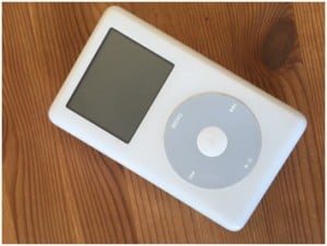
Then, while rummaging through a dresser drawer in my bedroom, I stumbled upon this dusty artifact:

Let’s consider this photo to be The Beginning.
What is UX?
At Fireside Agency, when we are talking about UX, we are commonly (but not always) referring to the following components of the overall design and functionality of a website or application:
User Interface
I love a good user interface! What exactly is one of those? A User Interface (or UI for short) is a fancy term for the layout and design of any given page on any given website or application. Typically, the UI will tend to follow a tried and tested pattern that ensures that the right content appears in the right place and that everything remains organized and visible.
However, as with many laws of design; opportunities to break the rules do arise and when they do, we tend to go ahead and smash them to pieces. It’s fun! It also brings about some unexpected and beautiful results.
Interaction Experience
When it comes to Interaction Experience, it’s got be a positive one. Simply put, the end-user should be able to find everything they are looking for relatively quickly and with zero anxiety. You might be surprised that I mentioned anxiety here but there is a tendency for people to get particularly stressed when engaging with technology. Often times there appear to be too many options, too much content to read, illogical menu arrangement, broken links etc. For good UX to work, the channels have to be clear and the end-user must intrinsically know how to get to where they want to go. There are a myriad of methods and strategies to make this happen but we’ll save that for another day.
Emotional Engagement
We’re talking about chemistry – that ineffable “spark” that theoretically you either feel or you don’t when you encounter someone or something.
Just like in a relationship; we’re looking to make emotional and intellectual connections that make up that elusive, mythical and memorable “connection” with the end-user. To create that “spark” from a design perspective requires a firm understanding of your target audience; we work out what makes them tick from an emotive standpoint and in doing so we can then decide how to create something that they will inevitably connect with and ultimately remember.
Wow Factor
People have a desire to experience something new and something different. I like to throw in a few practical surprises if possible, something that the end-user wasn’t expecting, but finds useful. For additional impact it’s really fun to allow the end-user find it independently, this way they take ownership of what they discovered and the hope is that that this then creates a bond –however superficial– to the brand. It might sound a bit nuts but I love this kind of stuff. The wow factor; it’s all in the details.
Which Components do we Use?
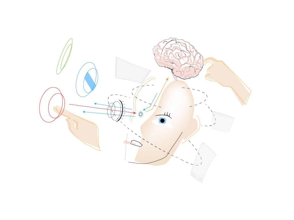
All of these components should be used at once; I prefer it to be that way because it makes for highly successful work! It must also be pointed out that UX is not technology driven but focuses on humans so ultimately, when approaching the design and development of a website or application from the perspective of User Experience, the end-user –the person– must be lobbied for from the beginning of the process all the way to the end. As the resident “UXer” here at Divine Designs that job falls squarely upon my shoulders; the advocate for the human being!
UX is not technology driven, but focuses on humans…
Yes, I’m repeating myself here (thanks for paying attention) but it’s really worth repeating because it’s the human element and the disregard for technology that makes UX such a fascinating –if not the most fascinating- component of the big web design/application design picture. I love the fact that it places the human condition in such high regard and with such great respect.
The End
I have long since stopped using the old iPod (the one at the beginning of this article) but I remember being really intrigued by it for a number of years. It seemed almost alien to me in its sparse simplicity. It was only later that I grew to really understand that the beauty of that simple white gadget was born from an innate understanding of humans.
“Design is a funny thing. Some people think design means how it looks. But of course, if you dig deeper, it’s really how it works.”
– Steve Jobs


