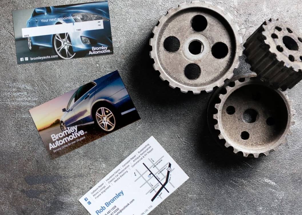
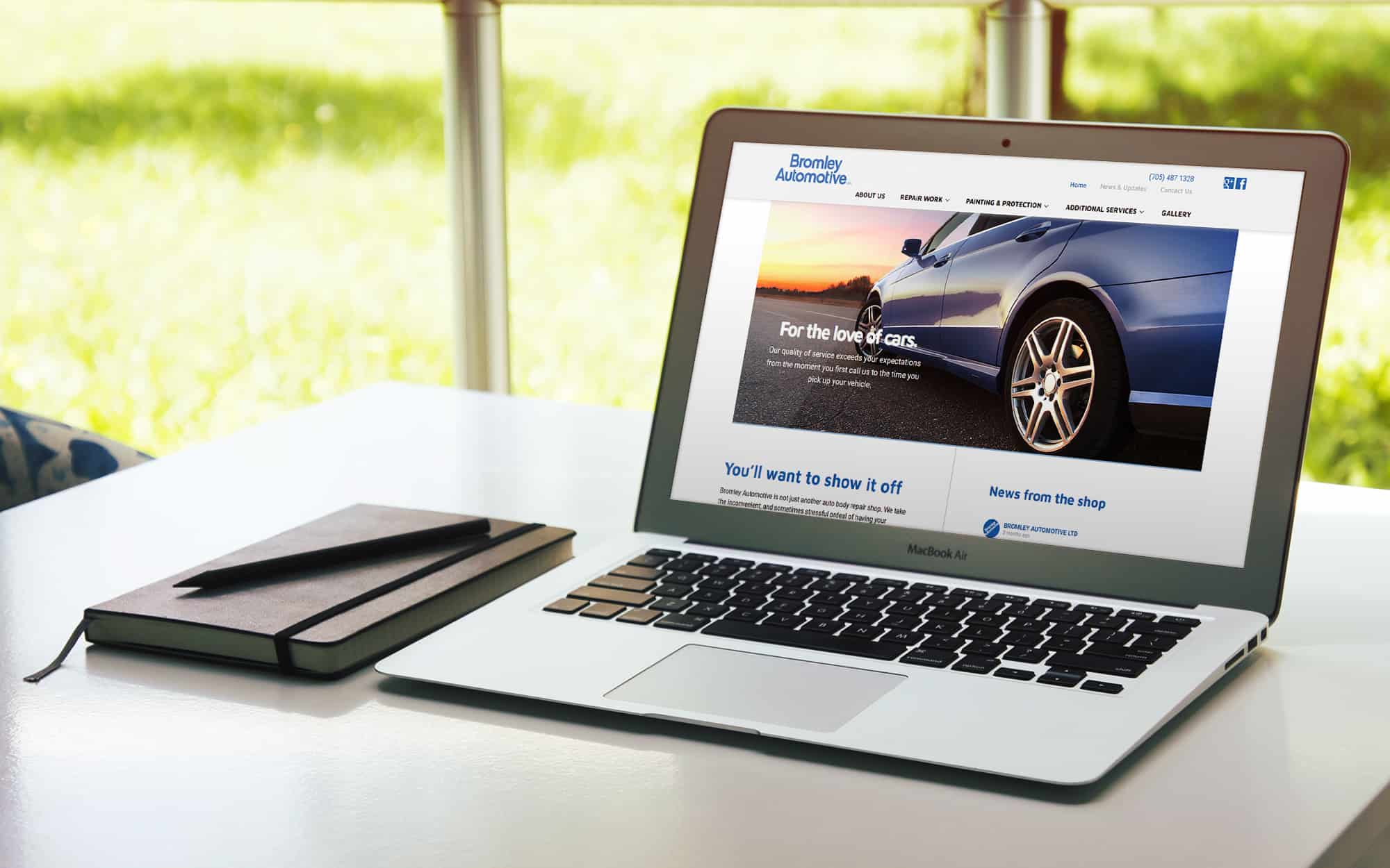
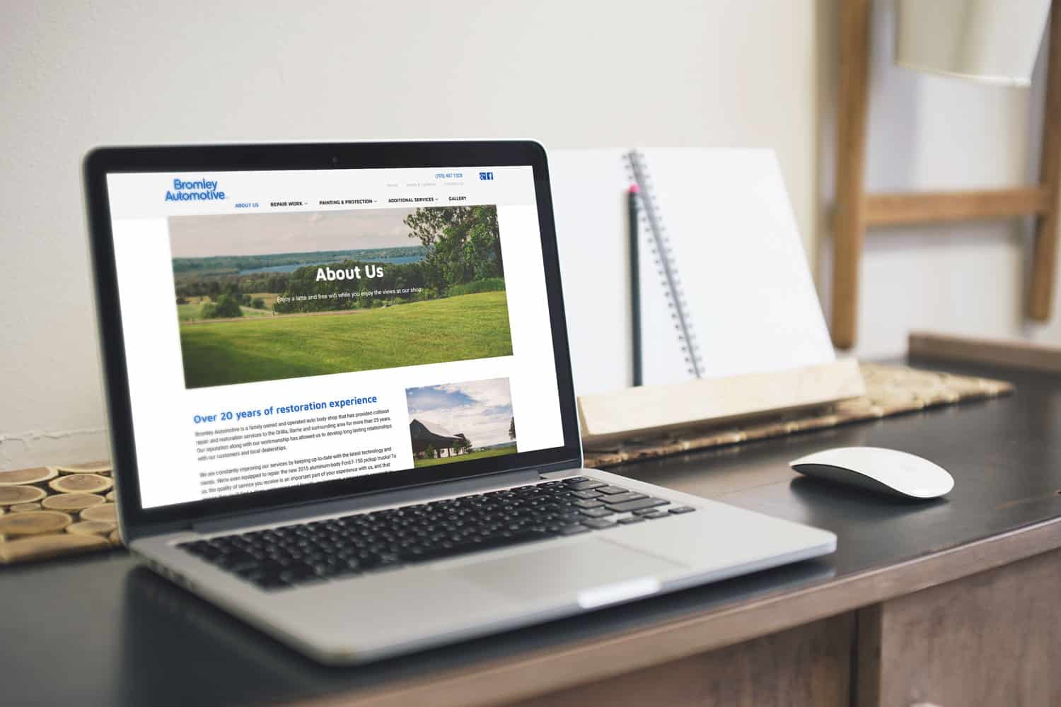
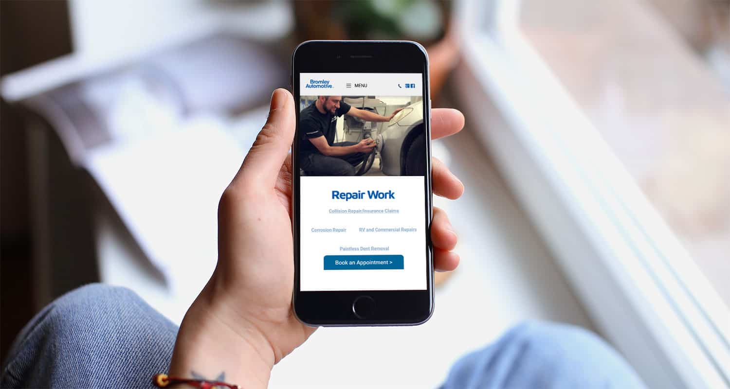
The Bromley family had been servicing the Barrie/Orillia area for years but had never had a cohesive and established brand or a website that was bringing in the right kind of leads. After a couple of Discovery sessions, we determined who they were trying to reach and decided to overhaul their core brand and website to do a better job of speaking to the target customer.
01
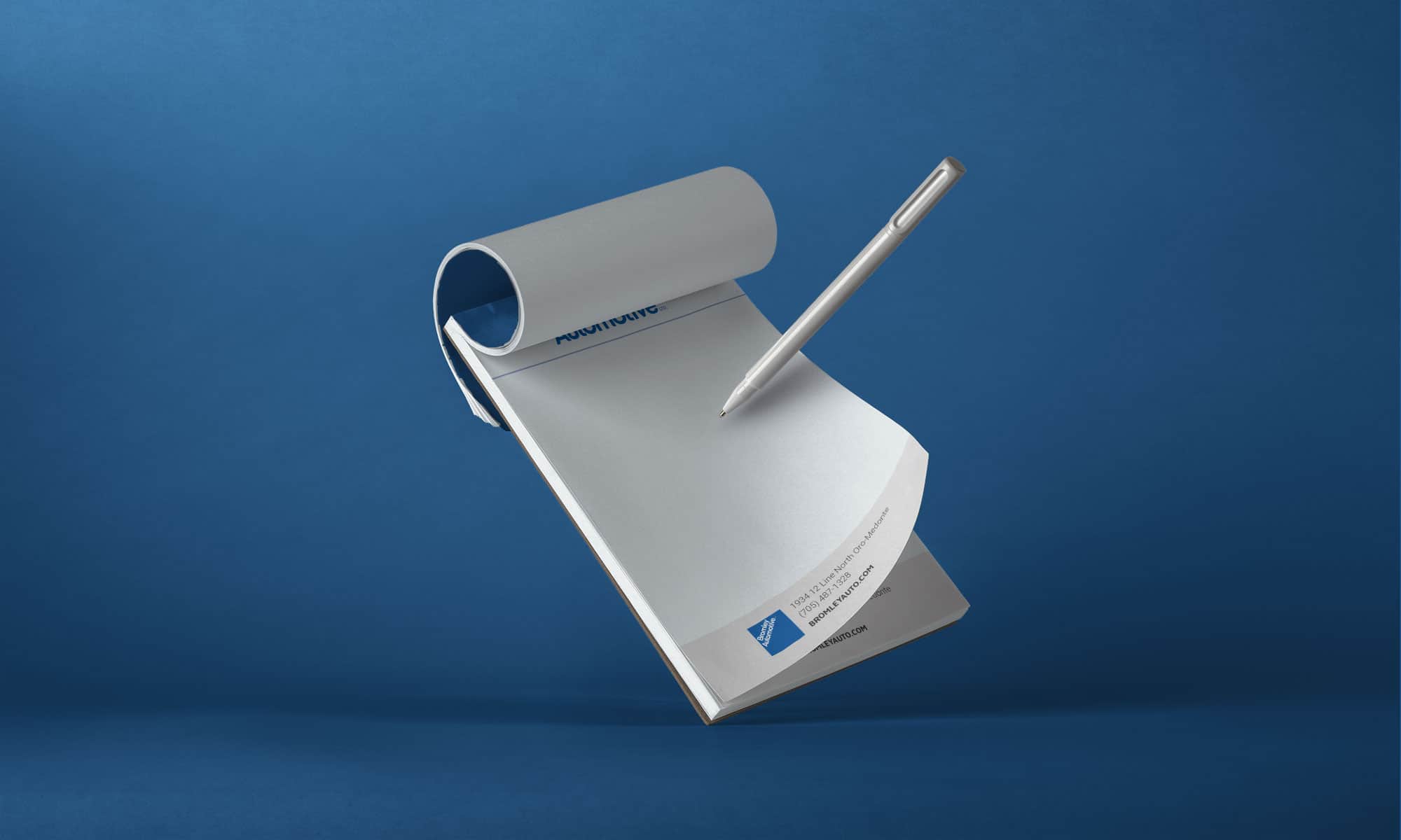
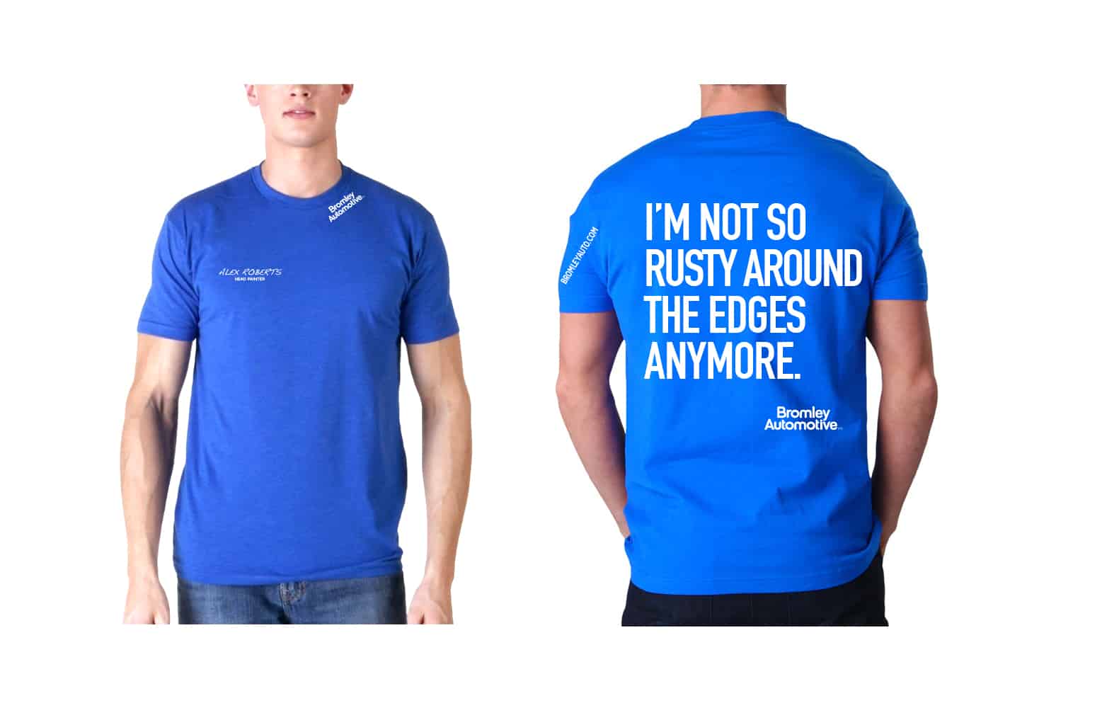
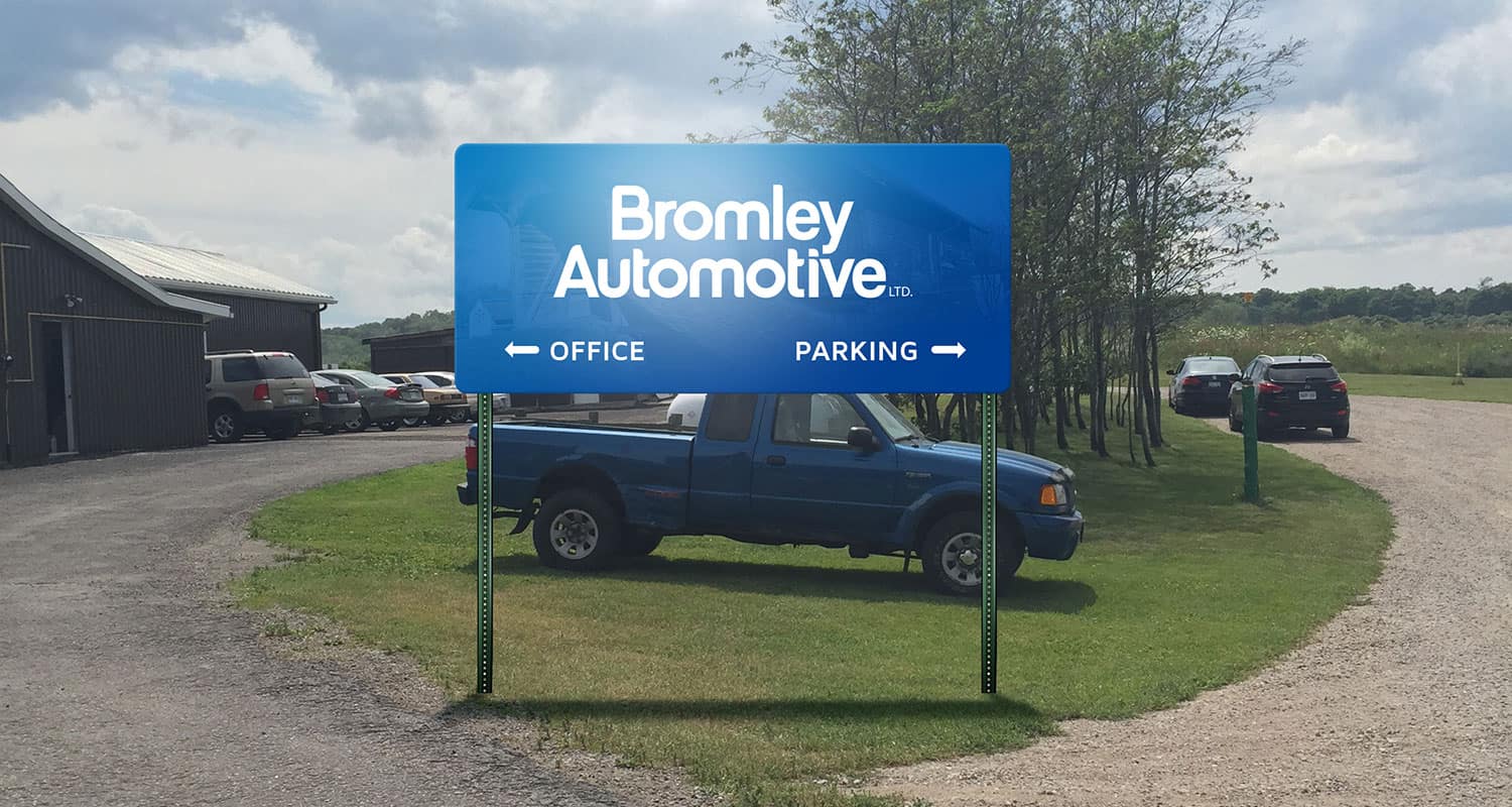
Branding
Logo
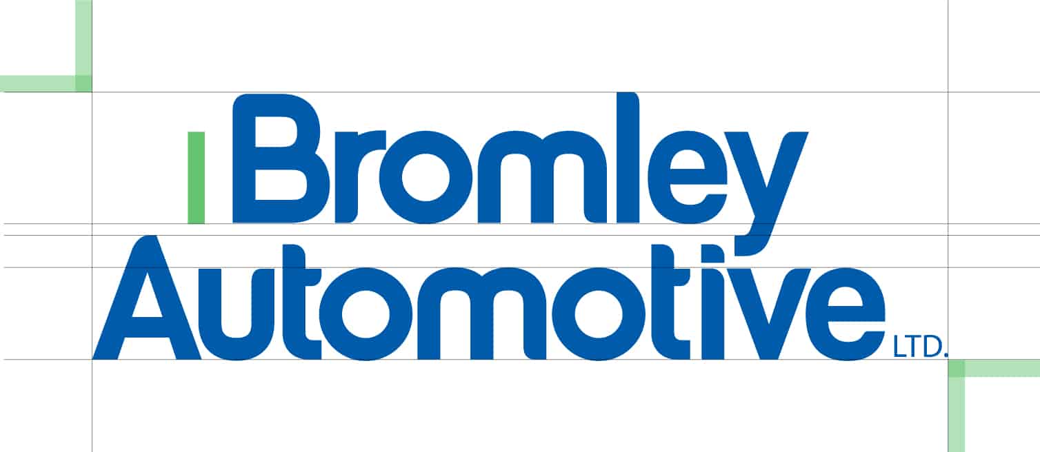
The logo existed already. It was a strong wordmark that had been established for years and was recognizable. We made a few small tweaks, but overall left the logo as it was.
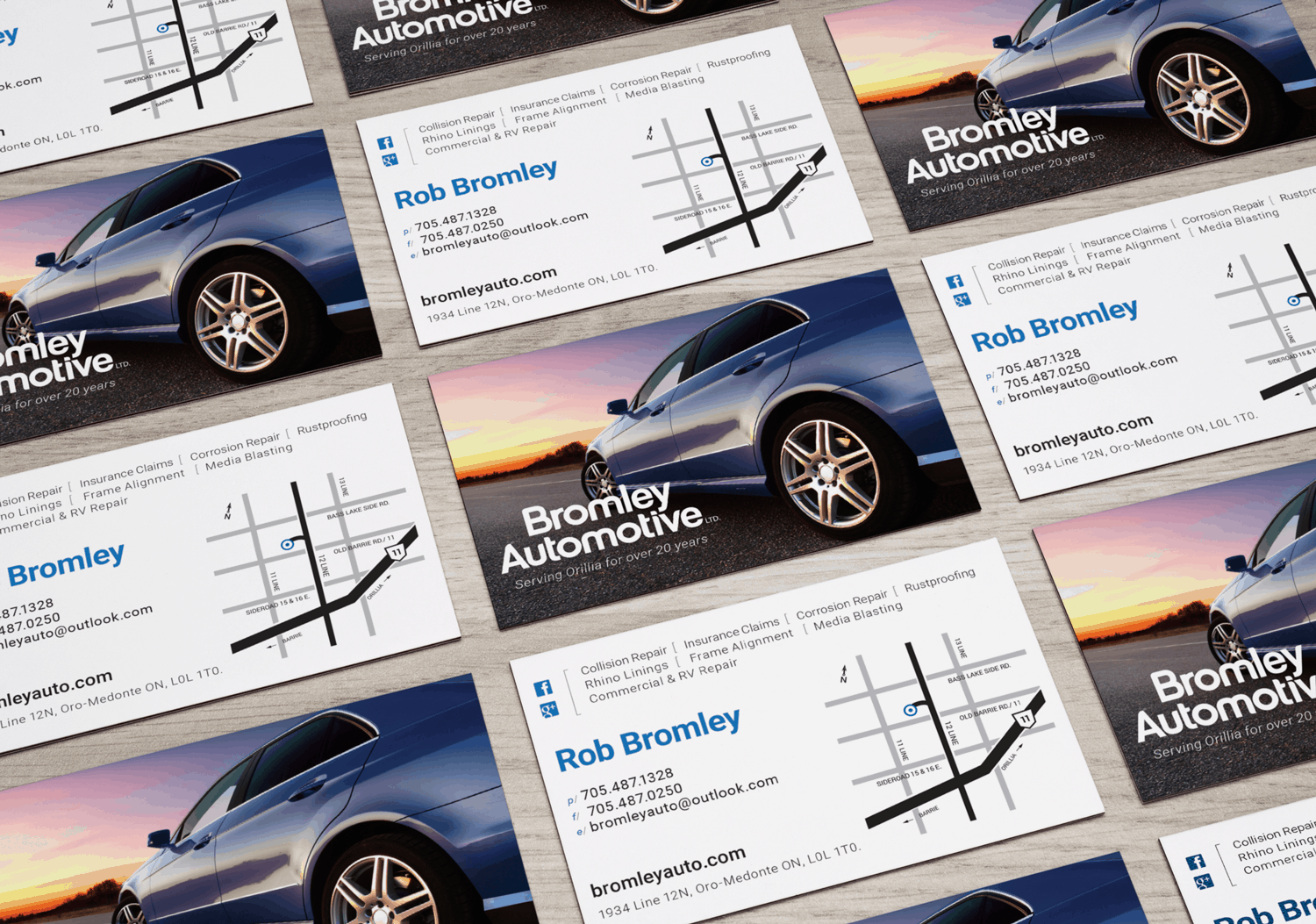
Colours
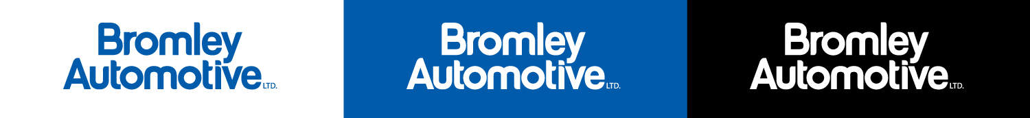
The company has strong connections with the local car dealerships and has a similar primary target audience; families driving regular vehicles. We decided to switch from the black/chrome look that spoke more to car buffs to a blue/white/grey colour scheme that felt more like a car dealership to subconsciously speak to those relationships.
Primary Colours
Fonts
Maven Pro was used for the heading because of its soft, inviting nature, which matches the company’s dedication to customer service, which is one of its differentiators. It’s complemented nicely with Roboto for the body copy. These fonts are inviting, confident and really represent the brand nicely.
02
Website Design
Website Design
Like the rest of the brand, the website was designed to speak to the family that drives a normal car, has a normal income and needs bodywork done. Bromley is the friendly, customer service-oriented option. The design is friendly, the text is friendly and fun and we put nice-looking smiling faces right on the homepage! We spent some additional time getting creative at the top of each service page, which gives the site and the company some real character.