00
Objectives
We were hired to improve the website and create the foundation for a consistent brand identity for the company.
01
Logo
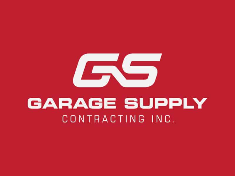
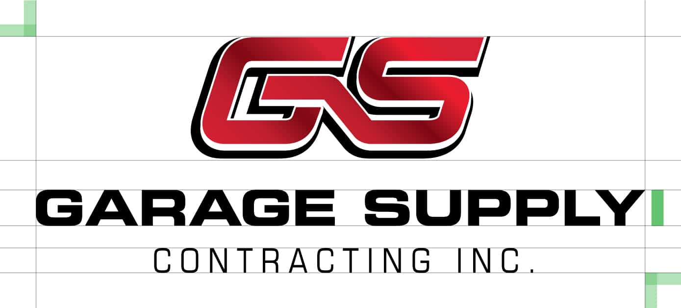
Garage Supply has been in business for over 100 years with the iconic GS wordmark in use for over 30 of those. When looking to refresh an iconic brand it’s important to maintain a sense of consistency so the new brand is still easily recognizable, although improved. We improved the logo dimensions, making it more compact and making the company name more readable. We also created a logo package with the logo provided in various formats for use in horizontal or vertical situations, different colours and a textured vs. a flat look.

Colours
With the red and black being established brand colours for so long we slightly modified the red so it was a little deeper and richer but for the most part, let the colours alone.
Primary Colours
Fonts
This brand uses Maven Pro for everything! A nice sans serif font that provides a lot of variation within itself just by utilizing different font weights and caps vs title case. It is used whenever possible and backed up by Arial or Helvetica online when older browsers are in use.

02
Website Design
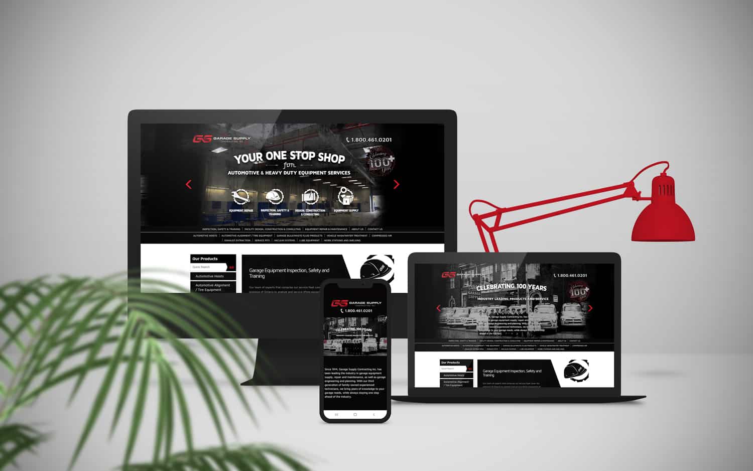
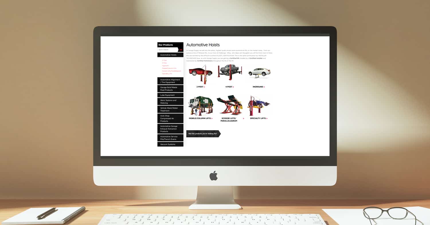
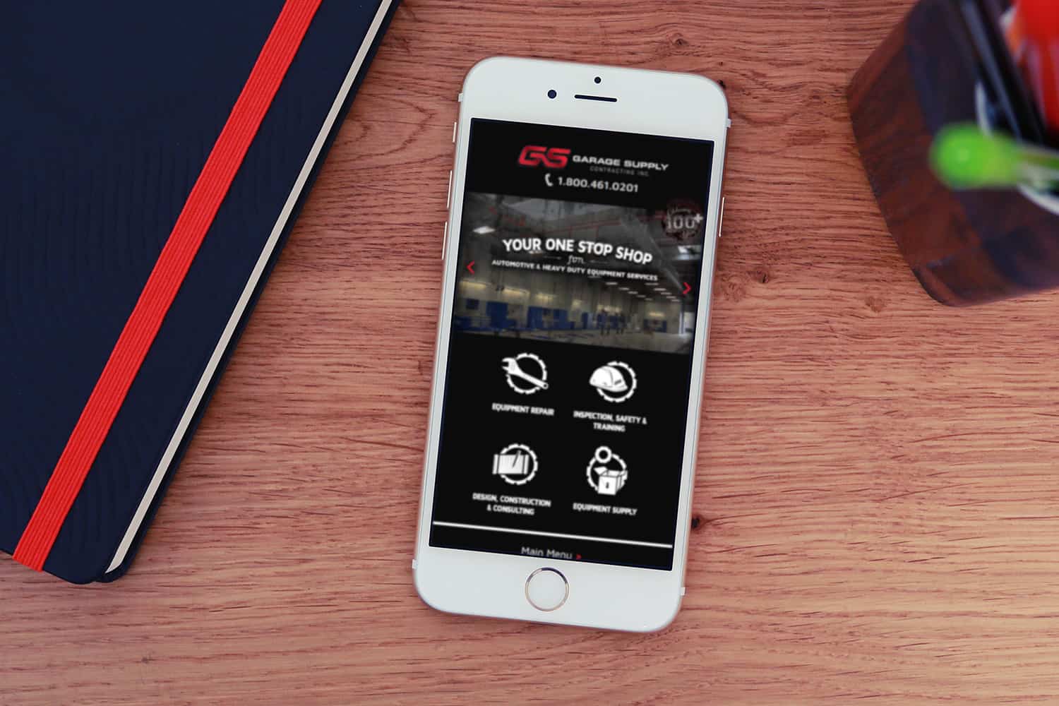
The website attempts to offer a modern user experience with a vintage look and feel through the use of icons, old photography and illustrative work. It also features an online catalogue and generates a lot of work for the company each year.
